When it comes to visual communication, a design can become outstanding by carefully utilizing the blank or empty spaces around important parts. Come explore the subtleties of negative space, its importance in improving readability, visual harmony, and simplicity, and how talented designers may use it as an effective tool. Get ready to explore the untapped power of whitespace and learn how it may transform your design projects.
What is Negative Space?
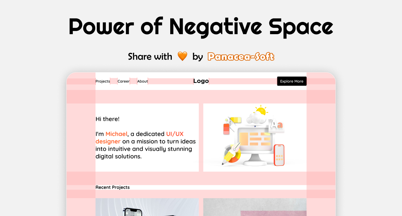
The blank or empty space that surrounds the main components of a composition is known as negative space, sometimes called white space. It is an essential component of design. It acts as the breathing space that makes a design’s essential components stand out out and communicate clearly. Designers may create balance, harmony, and emphasis in their works by deliberately utilizing negative space. This helps to direct the viewer’s attention and improve overall visual impact.
Negative Space in Content

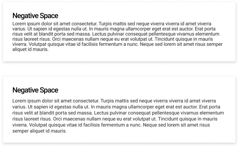
Effective use of negative space in content design is essential for improving readability and visual hierarchy. Designers can improve legibility and comprehension by ensuring sufficient spacing around headers, paragraphs, and other textual elements. A comfortable reading experience is ensured while preserving a sense of unity and simplicity by the use of adequate margins and proper line spacing, which give the information the breathing room it needs.
Simplicity through Negative Space

Design simplicity is demonstrated by the thoughtful use of negative space to provide integration and clarity in the visuals. Designers can prioritize important information and reduce distractions by purposely providing sufficient space around vital pieces to produce an uncluttered and harmonious layout. Using negative space enhances the entire user experience and makes navigation and interaction easier. It also promotes an elegant and refined design.
Overusing

The usage of negative space can have unexpected effects even if it is a useful technique for improving readability and design aesthetics. An excessive amount of empty space could lead away from the composition’s intended message or usefulness by creating a sense of emptiness or confusion. In order to enhance and accentuate the overall visual composition without overwhelming or ruining its effectiveness, designers must maintain a careful balance, making sure that negative space is used deliberately and wisely.
As we near the end of our exploration of the power of negative space, it is obvious that this sometimes ignored component is essential to successful design. Designers may produce compositions that are memorable, intuitive, and visually arresting by utilizing the natural properties of whitespace. Negative space promotes creativity and innovation in the design industry, whether it is applied to improve readability, enhance simplicity, or improve visual hierarchy. Embrace the opportunities that whitespace offers, and let its transforming power to lead you to new heights of artistic expression and superior aesthetics.
