Creating a distinct visual hierarchy is crucial to efficiently navigating users through the content on your website. You can aid users in understanding the relative significance of various parts and actions by arranging things logically and hierarchically. Make use of typographic, contrast, and space strategies to establish a visual hierarchy that improves readability and engagement on all platforms. You may ensure a unified and user-focused experience on your website by having a clearly defined visual hierarchy.
Breakpoints
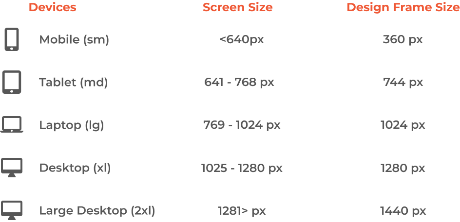
Breakpoints are essential to responsive design because they let your website work flawlessly on all types of devices. From mobile phones to desktop monitors, you can create a unified and visually appealing experience by picking the right breakpoints within your design system. Discover how to make the most of breakpoints to optimize the layout of your website for a range of screen widths, for example, by using frameworks like Tailwind CSS.
Images
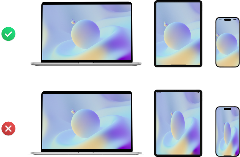
Scalable and high-resolution images should be given top priority in responsive design. Stretching photos might cause distortion and a bad user experience, therefore stay away from doing so. Choose pictures that can be dynamically cropped and resized to fit larger displays instead than ones that will lack quality. You can ensure ideal loading times and visual integrity on all devices by using responsive pictures.
Buttons
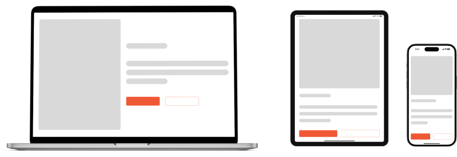
The size of interactive elements, such as buttons, is one aspect of responsive design that is sometimes ignored. It’s critical to optimize button sizes for mobile and tablet devices in order to build a user-friendly interface that makes the buttons simple to tap and interact with. Proper tap target sizes are important because they improve accessibility and usability, which will benefit your website’s user experience as a whole.
Typography
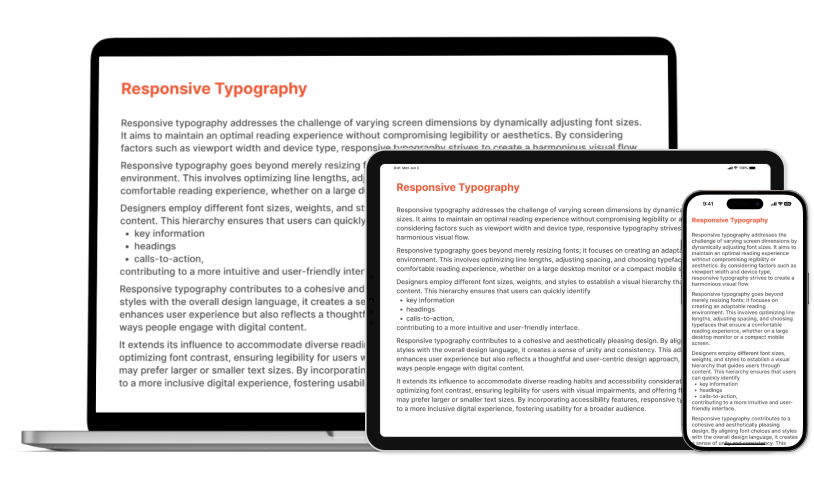
Your website’s visual identity and readability are greatly influenced by the typeface you use. To create a pleasing balance, font size alterations should be carefully considered while designing for responsiveness. Aim for typography that not only makes your website look better, but also works well with the content on a variety of screen sizes. You may give your website a polished and expert appearance by adhering to standard typographic principles.
Simple Navigation
Your website’s visual identity and readability are greatly influenced by the typeface you use. To create a pleasing balance, font size alterations should be carefully considered while designing for responsiveness. Aim for typography that not only makes your website look better, but also works well with the content on a variety of screen sizes. You may give your website a polished and expert appearance by adhering to standard typographic principles.
Visual Hierarchy
Creating a distinct visual hierarchy is crucial to efficiently navigating users through the content on your website. You can aid users in understanding the relative significance of various parts and actions by arranging things logically and hierarchically. Make use of typographic, contrast, and space strategies to establish a visual hierarchy that improves readability and engagement on all platforms. You may ensure a unified and user-focused experience on your website by having a clearly defined visual hierarchy.
With the ongoing advancements in technology, responsive design will become more and more important. You are able to ensure that your website is optimized for the wide range of devices used by today’s audiences by putting the advice in this blog post into action. Each aspect of responsive design, from setting breakpoints to optimizing photos and typography, is essential to providing a flawless user experience. You can keep ahead of the curve and give users an exciting and accessible online experience, regardless of the device they’re using, by giving responsiveness top priority in your web design efforts.
